We gradually discovered what makes this program so special: it's hyperlocal with art you won't always find in a museum. This led us to position Oregon Art Beat as the "guide to the offbeat," something that inspires people to treasure the work that’s made by neighbors, roommates, and strangers in passing. Made in locations as vast as shipyards to everyday as kitchen tables.
clients: Oregon public broadcasting (OPB), Portland state university
Collaborator: Nicholas zapata
Opportunity
Oregon Art Beat, a longstanding OPB (PBS) program dedicated to showcasing Oregon’s diverse creative community, was facing a brand awareness challenge. Despite its rich history, both lifelong Oregonians and new folks have been unfamiliar with the series. With increasing media saturation and federal arts funding cuts, it is critical to strengthen brand visibility.
Jeff Douglas, a former reporter who started on a science show exploring Oregon, went in search of the state's ecological secrets. However, during his travels through rural parts of Oregon, he uncovered a wealth of quirky and fascinating art. This discovery led the creation of Art Beat. Jeff was proud to have brought together these often-overlooked artistic treasures, and we saw an opportunity to reignite this connection with a new, refreshed approach.
Approach
We began with in-depth interviews with the show’s longest-standing producer and target audience members to uncover what resonates visually and philosophically. This audience values authenticity, imperfection, and the feeling of discovery, and our rebrand needed to connect with these values.
We gradually discovered what makes this program so special: it's hyperlocal and extremely current quality. Not only does Art Beat feature art you won't always find in a museum- many of the artists aren't untouchably famous, they're real people you can connect with This led us to position Oregon Art Beat as the "guide to the offbeat." As something that inspires people to treasure the work that’s made by neighbors, roommates, and strangers in passing. Made in locations as vast as shipyards to everyday as kitchen tables.
Result
ThIS speculative rebrand delivered a vision of Oregon Art Beat’s identity as an authentic guide from the artists themselves.
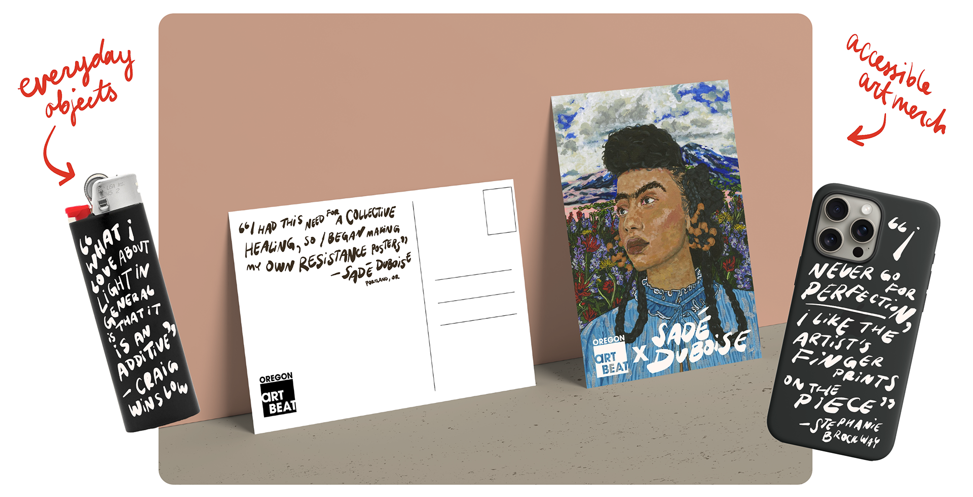
In order to foster timeless recognition for OAB, We chose to have a strong and stationary logo. The rest of the brand, however, is completely dynamic, meant to feel affected by each artist and their organic hand, crafting an intimate dialogue.
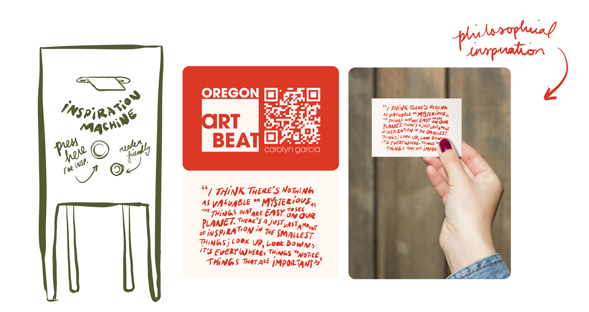
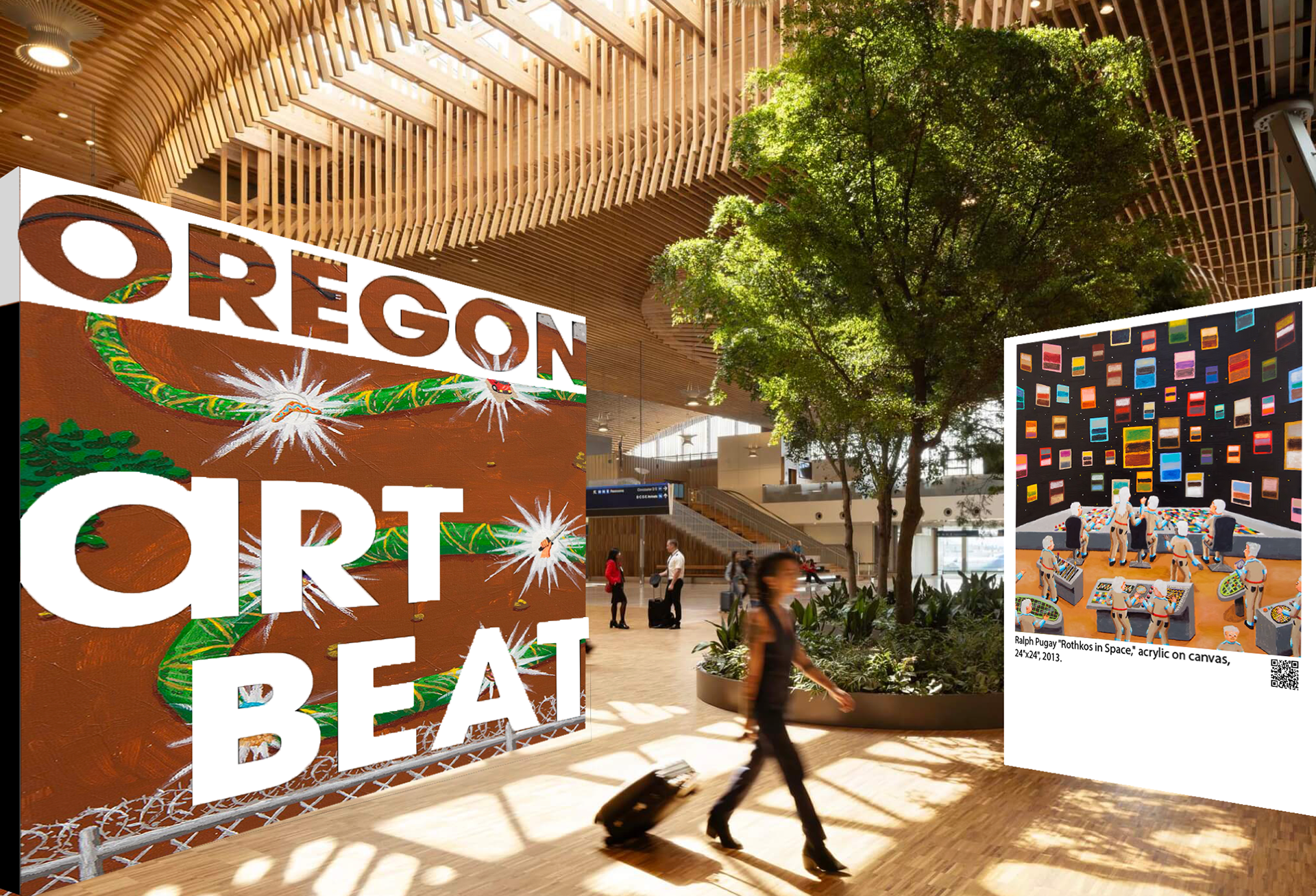
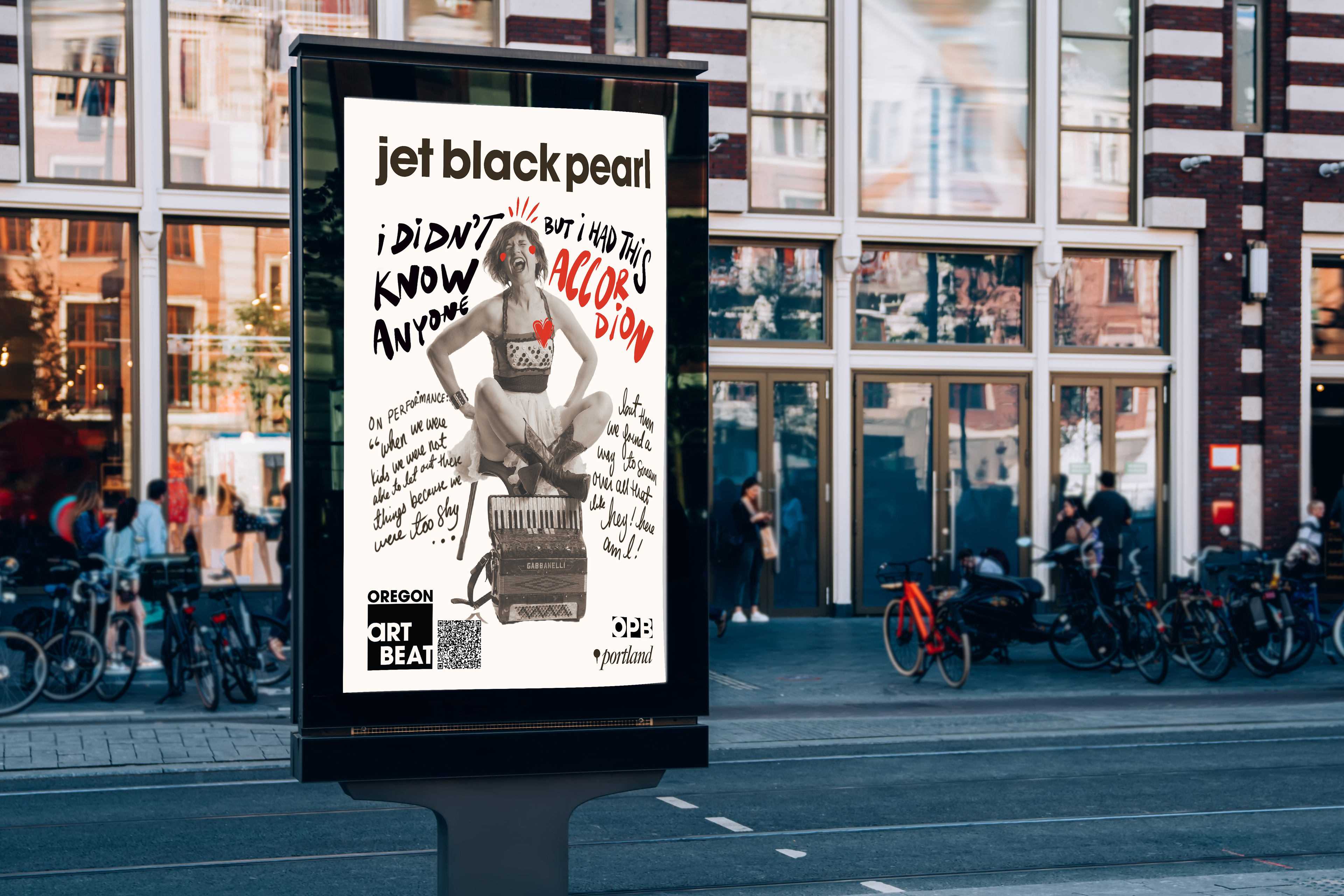
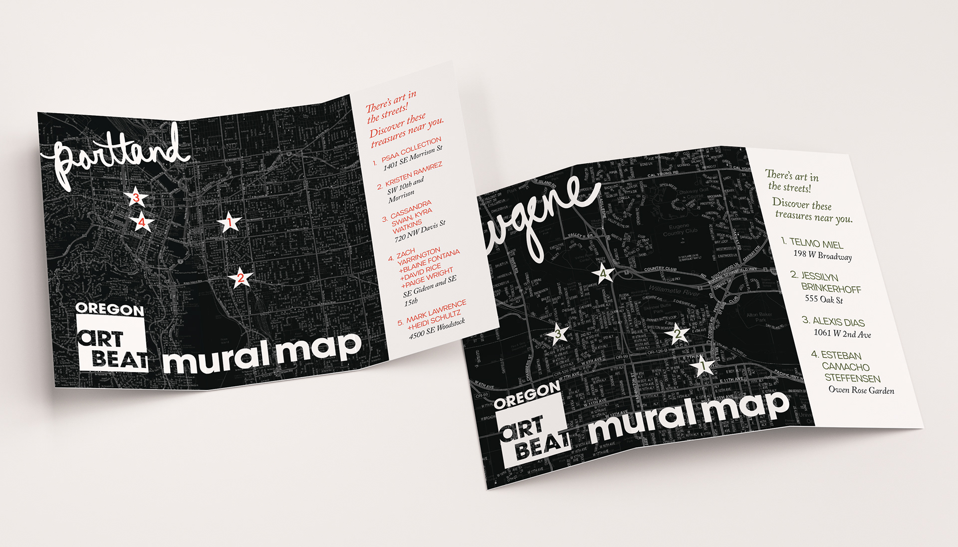
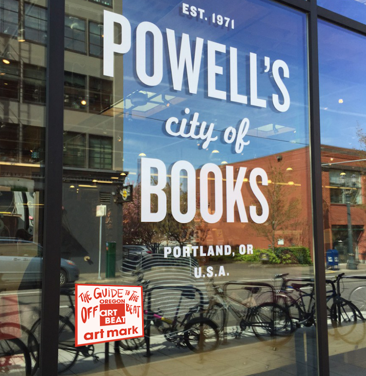
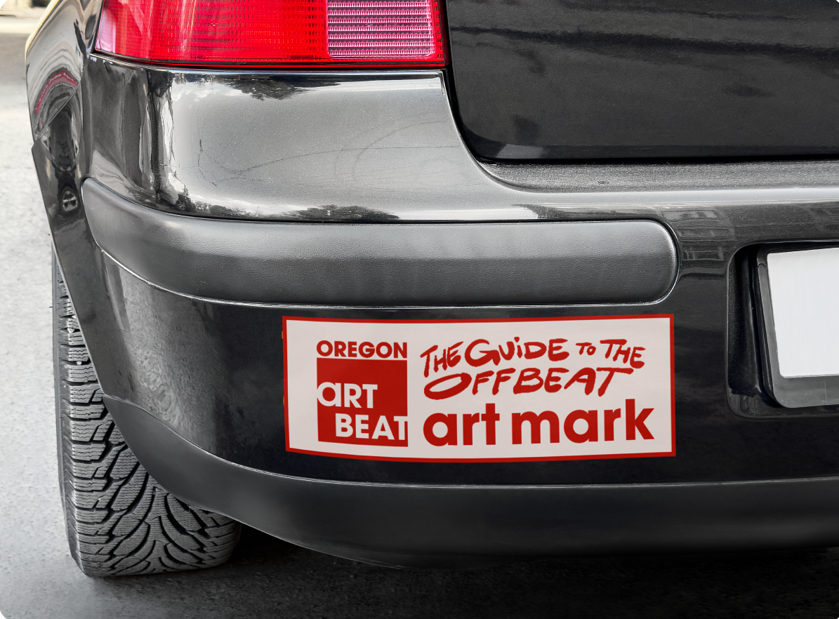
Through deep research, brand storytelling, and thoughtful activation ideas, we developed a full suite of strategic brand activations, including public art maps, social media templates, merchandise, and experiential activations. These activations were designed to bring Art Beat to life in the community, turning the show into an interactive, physical experience that’s both a guide to Oregon’s art scene and an invitation to explore it.
Logo
This logo is designed for versatility, allowing it to function across a variety of aesthetic directions while maintaining consistency. The bold sans-serif type conveys confidence, and the unique "A" from ITC Avant Garde Gothic adds a subtle touch of individuality. Separating “Oregon” and “Art Beat” suggests that while they’re related, Art Beat possesses its own identity beyond its geographical roots. The negative space between the letters resembles a wall with painted letters, connecting the logo to the visual language of the artistic community.
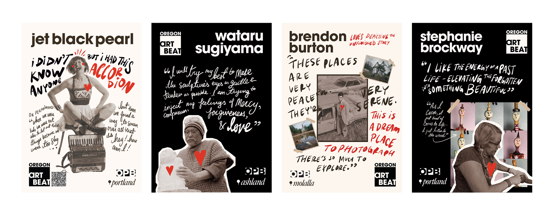
festival style posters
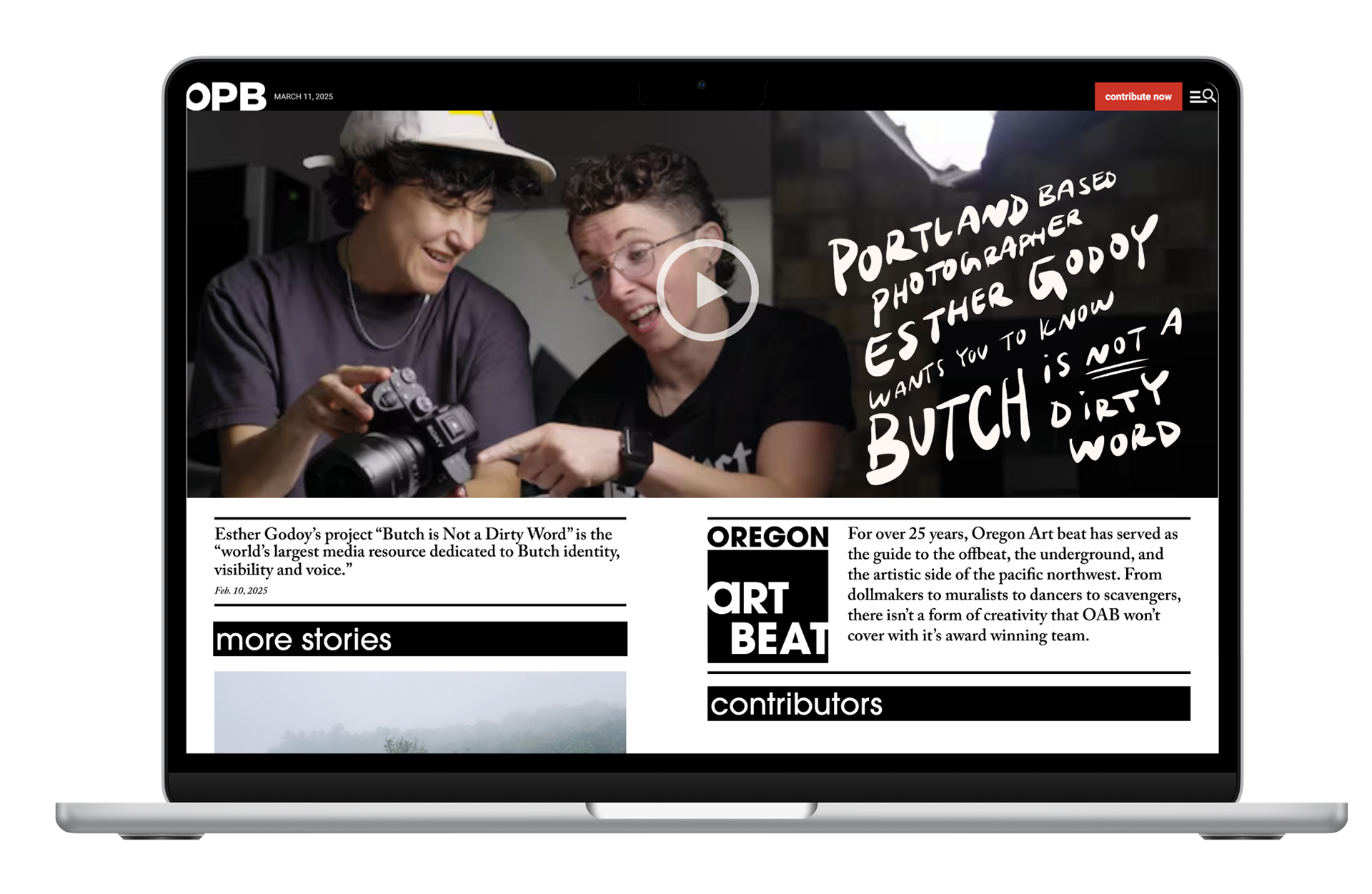
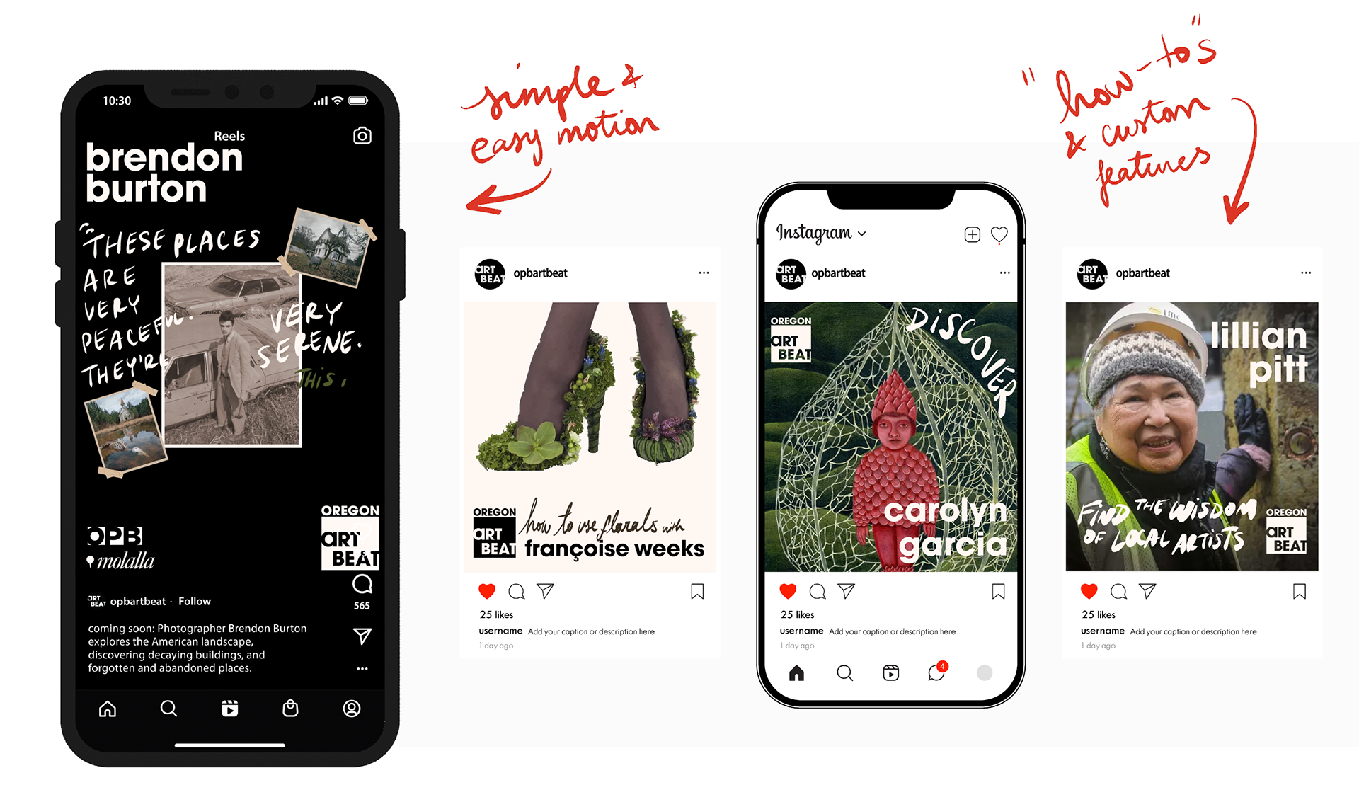
streaming + socials

Merchandise + travel collateral

Experiential activations